Gemini in Google Sheets: The Easiest Way to Use AI for Data Analysis
- Xuebin Wei

- Nov 7, 2025
- 3 min read
Updated: Dec 11, 2025
Writing complex formulas in Google Sheets can be powerful, but it's also time-consuming and difficult. What if you could ask your spreadsheet to analyze data for you? With the new Gemini integration in Google Sheets, you can.
This AI assistant completely changes your data analysis workflow. Instead of writing code or VLOOKUPs, you can use simple, natural language to find patterns, summarize trends, and even analyze raw text.
In this tutorial, we walk through two powerful examples to show you how to use Gemini—first with the "Ask Gemini" chat panel for quantitative data, and second with the in-cell AI() function for qualitative text analysis.
Watch the Full Video Tutorial
For the complete step-by-step walkthrough, watch our full video below.
Example 1: Quantitative Analysis with Gemini Google Sheets
The first way to use this AI is through the "Ask Gemini" side panel. It's perfect for gaining quick insights, generating charts, and understanding new datasets.
We began with a dataset of diamond sales, which included columns such as weight, color, clarity, and price.
Instead of building pivot tables, we simply:
Opened the file in Google Sheets.
Clicked the "Ask Gemini" button on the top right.
Asked it to "create some insights" from the data.

In seconds, Gemini generated several charts and key takeaways, like the average price by clarity and rating.
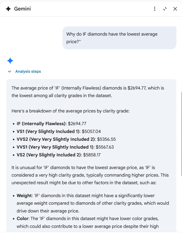
But the real power is in its reasoning ability. Gemini noted that "IF" (Internally Flawless) diamonds had the lowest average price, which seems wrong. We asked a follow-up question: "Why do IF diamonds have the lowest average price?"
Gemini re-analyzed the data and explained that in our specific dataset, the IF diamonds also had a significantly lower average weight and poorer color grades, which is why they were cheaper. This is an insight that would have taken much longer to find manually.
Example 2: Analyzing Text Data with the AI() Function
The second, and arguably more powerful, method is using the AI() function directly in a cell. This lets you apply AI to thousands of rows at once.
We used a messy dataset of tweets about Generative AI, which had two columns: the tweet text (in multiple languages) and a user-provided location.
Performing Sentiment Analysis
First, we wanted to know the sentiment of each tweet. In a new column, we typed this simple formula:
=AI("use a single word to identify the sentiment of the tweet", A2)We hit enter, and Google Sheets automatically filled the formula down the entire column, labeling each tweet as "Positive," "Negative," "Neutral," "Cautions," etc.

Extracting Latitude and Longitude from Messy Text
The real challenge was the accuracy of the location data. The "location" column was a free-text field, containing entries ranging from "Tokyo, Japan" and "San Francisco, CA" to "Global" or blank entries.
Manually cleaning this and finding coordinates would be a nightmare. With Gemini, it was two simple formulas:
In the "Latitude" column:
=AI("use one number to extract the latitude of the user location", B2)In the "Longitude" column:
=AI("use one number to extract the longitude of the user location", B2)Gemini's AI understood the messy text and extracted the precise geographic coordinates for each valid location.

Bonus: Visualizing Your AI-Cleaned Data in Tableau
Now that Gemini has done the hard work of cleaning our data, we can easily visualize it. While Google Sheets can create a basic map, we can take it one step further with a professional tool like Tableau Public.
Tableau can connect directly to your Google Drive. We loaded our newly cleaned Google Sheet and, in just a few minutes, built a fully interactive dashboard.
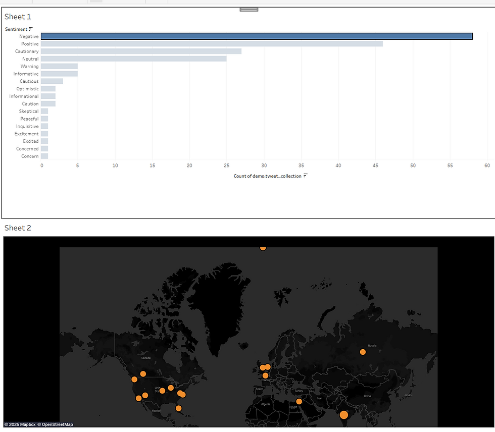
The dashboard features:
A bar chart showing the count of each sentiment.
A world map plotting the location of each tweet.
The best part? The charts are linked. If you click on the "Negative" bar in the chart, the map instantly filters to show you only the locations from which negative tweets are coming.
Conclusion: Your Spreadsheet is Now a Data Scientist
Gemini in Google Sheets is a game-changer. It lowers the barrier to entry for serious data analysis, allowing you to move from raw data to deep insights in seconds. By simply describing what you want, you can analyze numbers, interpret text, and prepare data for visualization without writing a single line of complex code.
For more data analysis tutorials and AI guides, be sure to explore more content on LBSocial!
Comments